Section 3.1 - Video "Signs of Climate Change"
Presented by Prof. Mat Collins (I taught him on a course once - not sure I taught him anything he didn't know already though!).
Key points for me:
- There has been a massive increase in the accuracy and number of measurements of the weather during the 20th Century.
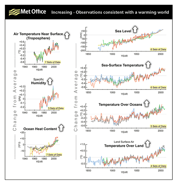
- Lots of analysis shows that both land and sea temperatures both have a rising trend (yearly and decade-to-decade variations still take place though).
- The Arctic polar region has seen the largest rise in temperatures.
- Sea levels have been rising since the 1880's.
- Don't confuse melting sea-ice with rising sea-levels - sea ice is floating and has already displaced the water, it's land ice from glaciers melting that have contributed to this.
- The GOES-R satellite video was rather over-blown - but the satellite program has a web site at http://www.goes-r.gov and a PDF trifold here.
Section 3.2 - Read this Met Office web page about climate change indicators.
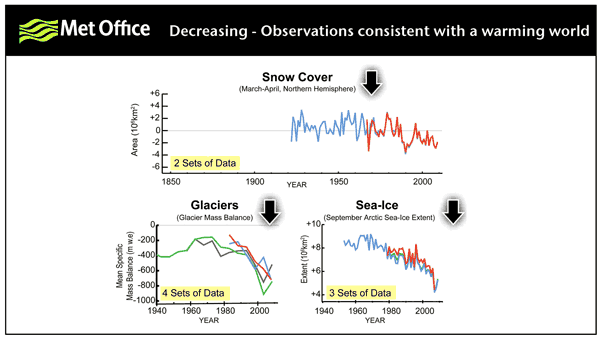
Lots of people in the discussions are looking at this page summarising the key indicators, which includes these two images:
and this one:
Section 3.3 - State of the Climate - extreme events - discussion
Pointed us to Cimate.gov extreme weather analysis - the nearest to me (Exeter, UK) was that 2012 was the second wettest year on record for the UK, only narrowly behind 2000.
We were also asked to read this press release from NSDIC which is about Arctic sea ice extent (not as much as in the past, with a 33 year downward trend) and Antarctic sea ice extent (near record extent, due to increased westerly winds in those latitudes making it cooler).
The fact that 2012 was the second wettest year on record isn't in itself an indication of climate change, but lots of other indicators over a longer period (typically 30 years) provides evidence of climate change.
Section 3.4 - Your warming world
A discussion piece, using the CMIP5 Global Climate Change Viewer
CMIP5 is Phase 5 of the Coupled Model Intercomparison Project
Q. What places on Earth have experienced the largest warming from 1980-2004?
A. Mean model annual mean temperature rises are greatest over Russia and Canada, the former having some models show a 7 deg. C. increase.
Q. Are the areas that are experiencing the most warming also showing the largest variability in temperature and or precipitation?
A. No, greatest increase in annual mean precipitation appears to be over Papua New Guinea, Ecuador and Indonesia.
Section 3.5 - Urgent Action
Read this statement from the American Geophysical Union.
Q. Having read the statement what would you consider the largest threats to where you live?
A. Living near the coast in South-West England, I think the biggest threats to this area are likely to be the effects of any increases in coastal high waters - this is very topical at the time of writing with lots of storms and damage to nearby coastal areas taking place, increased rates of coastal erosion and a large proportion of the Somerset Levels being flooded for more than a month now. Some of these may be due to changes in the historical pattern of variability and storminess or increases in the amount of precipitation.
Section 3.6 - Our changing carbon cycle
A video from Prof. Pierre Friedlingstein.
Key points:
10 petagrams of carbon, that's 10 to the power of 16 grams of carbon, are released to the atmosphere every year due to human activities. In 2013, the Mauna Loa Observatory in Hawaii recorded a milestone concentration of atmospheric CO2 of 400 PPM, a value not rated over about a million years (Keeling Curve) 90% of the emission of CO2 comes from the burning of fossil fuel The remaining 10% comes from deforestation. For fossil fuel emission of CO2, the main countries emitting CO2 are developed countries, such as USA, Europe, Japan, although emerging countries like China and India are also becoming more and more important. For deforestation, the main emitters are developing countries in the tropics such as Brazil or Indonesia. The net increase in the atmosphere though is 4.5 petagrams of CO2 per year - the rest is "sunk" over the oceans and land. Over the deep oceans - more CO2 in the atmosphere means more CO2 in contact with the surface of the ocean, and then for more export of carbon through the deep ocean. This is the largest proportion. Over land - more CO2 in the atmosphere means more photosynthesis, more plant growth, more biomass, and therefore, more land sinks.
Section 3.6 - Global Carbon Emissions
Playing with the World Bank data indicator graph tool I drew two graphs.
- http://data.worldbank.org/indicator/EN.ATM.CO2E.PC/countries/CN-GB-US-IN-BR-AU-DE?display=graph - shows that some developed nations produce significantly more CO2 per capita than others, but these may be falling, but are still way in excess of developing nations
- http://data.worldbank.org/indicator/EN.ATM.CO2E.KT/countries/CN-GB-US-IN-BR-AU-DE?display=graph - shows that due to the development and large populations of the developing nations, the largest increase in emissions will come from these developing nations.
The conclusion is that to reduce the overall level of CO2 emissions, further reductions will be necessary in developed nations - where the trend is beginning to move in the right direction. But action needs to be taken to stem the growth in emissions per capita in the developing nations.
Reflections on this week
- I got through the material quicker than last week, just two sittings to get through all the sections.
- I was interested in the variety of sources out there on the internet, and the number of tools it is possible to access to play around with the data.
- I got my best score so far in the end of section quiz (14/15).
- I was struck by the number of indicators that all show the same message - the Earth is warming.
- I was prompted to think about the impact of this - and came to the rather selfish view that living in a developed nation we'd probably cope OK with this, it was elsewhere that the effects would be felt the worst.
- Interesting nuggets picked up - melting sea-ice doesn't contribute to rising sea levels and explanations of why the Arctic is getting warmer, but the Antarctic sea ice is becoming more extensive (ice-albedo feedback, and increased wind speeds respectively).
- I'm proud that my blogging skills are getting better with more links and pictures in the blog - I hope you like these!


No comments:
Post a Comment